
Story of Texas Outage in Feb 2021
Summary: Tableau is a popular visualization software. I collected Texas outage data and visualize it in Tableau.
Contents
- 1. Introduction
- 2. Data Collection
- 3. Data processing
- 4. Visualization in Tableau
- 4.1 Evolution of outage(left) and temperature(right)
- 4.2 Comparing the evolution in one map
- 4.3 Heatmap of counties’ total reduced power at each time
- 4.4 Heatmap of counties’ temperature at each time
- 4.5 Line chart of each county’s temperature and reduced power
- 4.6 Total reduced power by fuel type
- 4.7 Top X counties suffer power outage at each time
1. Introduction
I want to visualize the Texas power outage during Feb.10 to Feb.19 hour by hour in Tableau.
- Firstly, collecting outage data, weather history data and Texas county data.
- Secondly, processing the data.
- Lastly, visualizing the processed data in Tableau.
Notebook for collecting and processing data can be found here
2. Data Collection
In this part, I will collect outage data, weather history data and Texas county data.
- Outage data is from: ERCOT, Generation Resource and Energy Storage Resource Outages and Derates for February 10-19, 2021 Excel Version.
- Texas county list is from: Texas-Counties-Centroid-Map. Another source is Wikipedia.
- Weather history data is from: Meteostat, weather stations list is here.
2.1 Outage data
outage = pd.read_excel('outage_feb1019.xlsx', sheet_name='OutageData')
print(f'Outage size: {outage.shape}')
outage.head(3)
outage['FUEL TYPE'].unique()
array(['WIND', 'NG', 'COAL', 'SOLAR', 'ESR', 'HYDRO', 'NUCLEAR'], dtype=object)
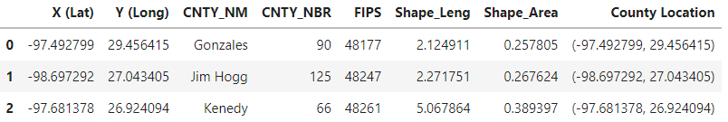
2.2 County data
cnty = pd.read_csv('Texas_Counties_Centroid_Map.csv')
print(f'County size: {cnty.shape}')
cnty.head(3)
County size: (254, 8)
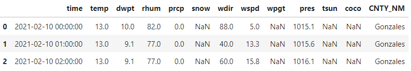
2.3 Weather history data
##scrape weather history data hourly
stations = Stations()
# Set time period
start = datetime(2021, 2, 10)
end = datetime(2021, 2, 19, 23, 59)

# for idx in tqdm(range(len(cnty))):
# for idx in range(len(cnty)):
idx_s = 200 #change this in tiny step to avoid blocking
idx_e = len(cnty)
for idx in tqdm(range(idx_s, idx_e)):
    cnty_name = cnty['CNTY_NM'][idx]
    lat = cnty['X (Lat)'][idx].round(4)
    lon = cnty['Y (Long)'][idx].round(4)
    stations = stations.nearby(lon, lat)
    station = stations.fetch(1)

    # Get daily data for 2018
    data = Hourly(station.index[0], start, end) #https://dev.meteostat.net/python/hourly.html#example
    data = data.fetch()
    data.reset_index(inplace=True) #the time was used as index, reset it
    data['COUNTY'] = cnty_name

    if idx == idx_s:
        hourly_data = data
    else:
        hourly_data = hourly_data.append(data)


hourly_data.reset_index(inplace=True)
hourly_data.to_csv('hourly_data_200_last.csv')
Combining all weather data together:
hourly_data_0_99 = pd.read_csv('hourly_data_0_99.csv')
hourly_data_100_149 = pd.read_csv('hourly_data_100_149.csv')
hourly_data_150_199 = pd.read_csv('hourly_data_150_199.csv')
hourly_data_200_last = pd.read_csv('hourly_data_200_last.csv')

hourly_data = pd.concat([hourly_data_0_99, hourly_data_100_149, hourly_data_150_199, hourly_data_200_last], axis=0)
Cleaning the data names:
hourly_data.drop(['Unnamed: 0', 'index'], inplace=True, axis=1)
hourly_data.rename(columns={'COUNTY': 'CNTY_NM'}, inplace=True)
hourly_data.reset_index(drop=True, inplace=True)
hourly_data.to_csv('hourly_data.csv')
hourly_data.head(3)
3. Data processing
3.1 Picking useful features from weather data
Adding county information to weather data and pick usefull features from the weather data.
hourly_data = pd.read_csv('hourly_data.csv')
cnty_xycnty = cnty[['X (Lat)', 'Y (Long)', 'CNTY_NM', 'CNTY_NBR', 'FIPS']]
weather_data = hourly_data.merge(cnty_xycnty, how='inner', on='CNTY_NM') #addX (Lat)', 'Y (Long) to weather data
weather_data['CNTY_NM'] = weather_data['CNTY_NM'].str.upper()
# weather_data['time'] = pd.Timestamp(weather_data['time'])
weather_data['time'] = pd.to_datetime(weather_data['time']) #str to timestamp
# df['Timestamp'] = pd.to_datetime(df['Timestamp'], unit='s')
weather_data['State'] = 'Texas'
weather_cut = weather_data[['State', 'CNTY_NM', 'X (Lat)', 'Y (Long)', 'CNTY_NBR', 'FIPS', 'time', 'temp', 'coco']]
print(f'weather_cut shape: {weather_cut.shape}')
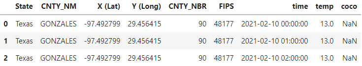
weather_cut.head(3)
weather_cut shape: (59760, 9)
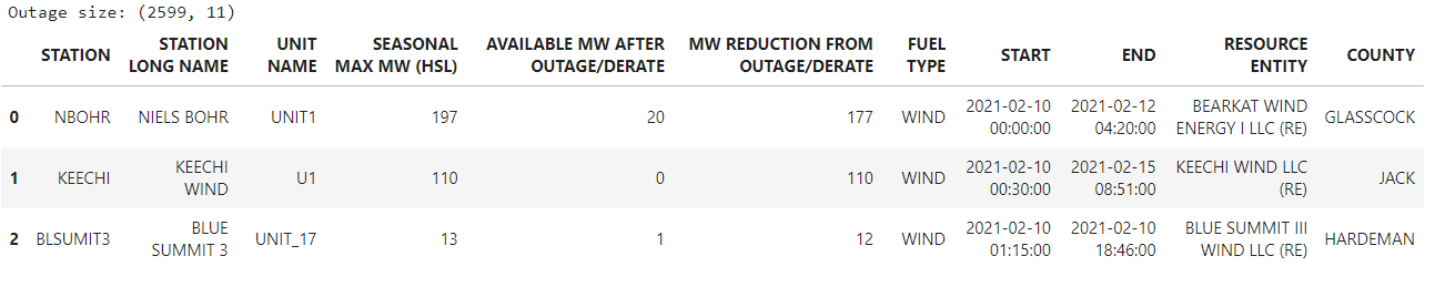
3.2 Picking useful features from the outage data
outage_cut = outage.drop(['STATION LONG NAME', 'UNIT NAME', 'RESOURCE ENTITY'], axis=1)
outage_cut.rename(columns={'SEASONAL MAX MW (HSL)': 'MAX_MW', 'AVAILABLE MW AFTER OUTAGE/DERATE': 'AVAI_MW', 'MW REDUCTION FROM OUTAGE/DERATE': 'REDU_MW'}, inplace=True)
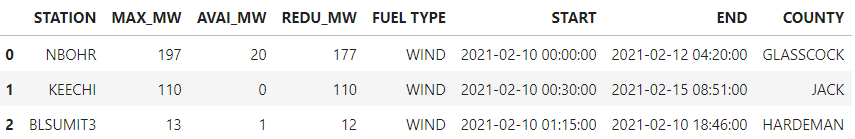
outage_cut.head(3)
3.3 Adding outage info to weather_cut_drop.
For each county at each hour, checking if it’s suffering outage or not. The total MAX_MW, AVAIL_MW, REDU_MW will be added.
'''
Adding columns for reduced MW with different fuel type
'''
weather_cut_drop = weather_cut.copy()
# outage['FUEL TYPE'].unique():  ['WIND', 'NG', 'COAL', 'SOLAR', 'ESR', 'HYDRO', 'NUCLEAR']
rng = len(weather_cut_drop)
weather_cut_drop = weather_cut.copy()

for FT in outage['FUEL TYPE'].unique():
    weather_cut_drop[FT + '_recu_mw'] = pd.DataFrame([0] * rng)

weather_cut_drop.head(3)
Calculating total reduced power of each fuel type for each county at every hour.
'''
loop through every pair
'''
rng = len(weather_cut_drop)
for index_weather in tqdm(range(rng)):
    for index_outage in range(len(outage_cut)):
        if weather_cut_drop['CNTY_NM'][index_weather] == outage_cut['COUNTY'][index_outage]:
            #think aobut the efficiency on accesing data in dataframe
            if weather_cut_drop['time'][index_weather] > outage_cut['START'][index_outage] and \
                            weather_cut_drop['time'][index_weather] < outage_cut['END'][index_outage] :
                FT = outage_cut['FUEL TYPE'][index_outage]
                weather_cut_drop[FT + '_recu_mw'][index_weather] = \
                    weather_cut_drop[FT + '_recu_mw'][index_weather] + outage_cut['REDU_MW'][index_outage]
weather_cut_drop.to_csv('cnty_weather_out_v2.csv')
weather_cut_drop.head(3)
4. Visualization in Tableau
Import cnty_weather_out_v2.csv to Tableau and visualize the data.
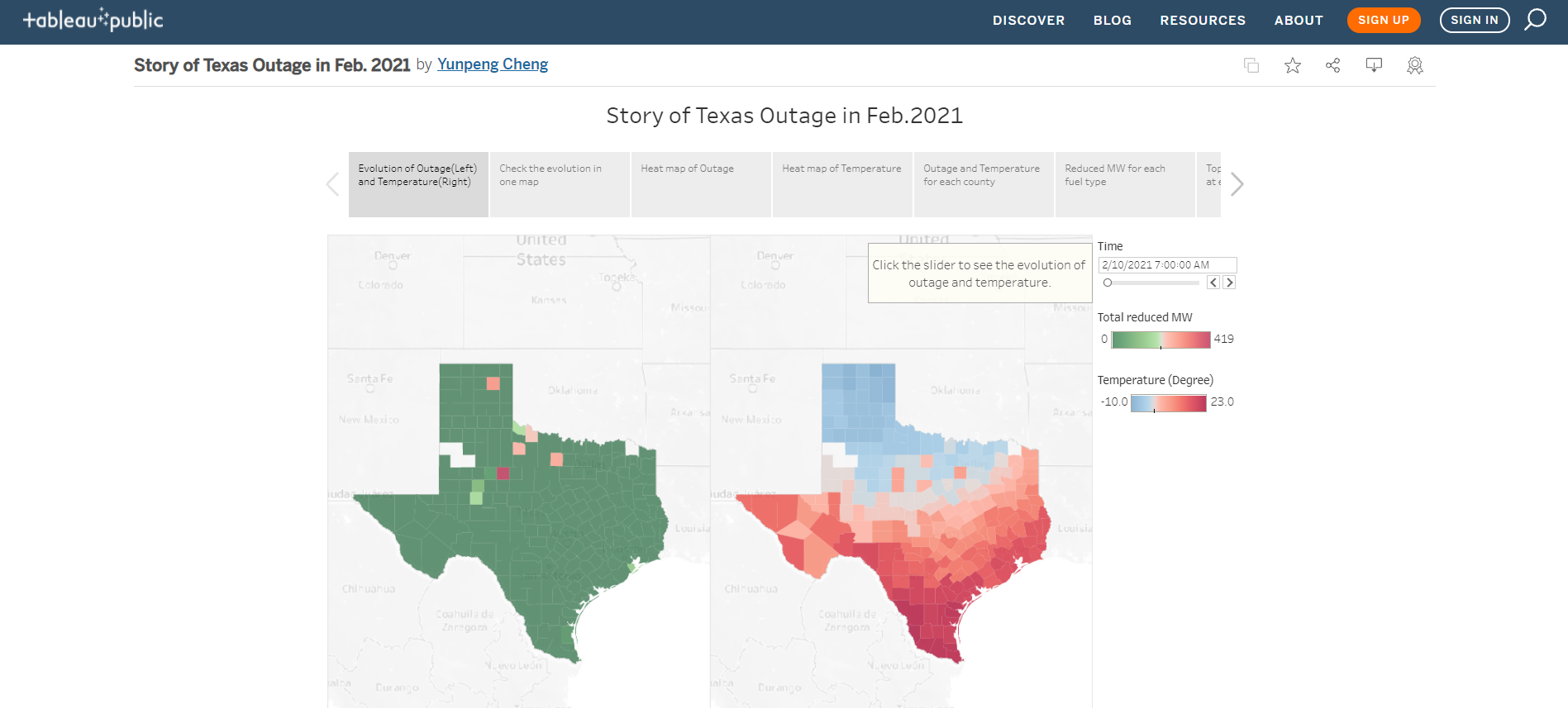
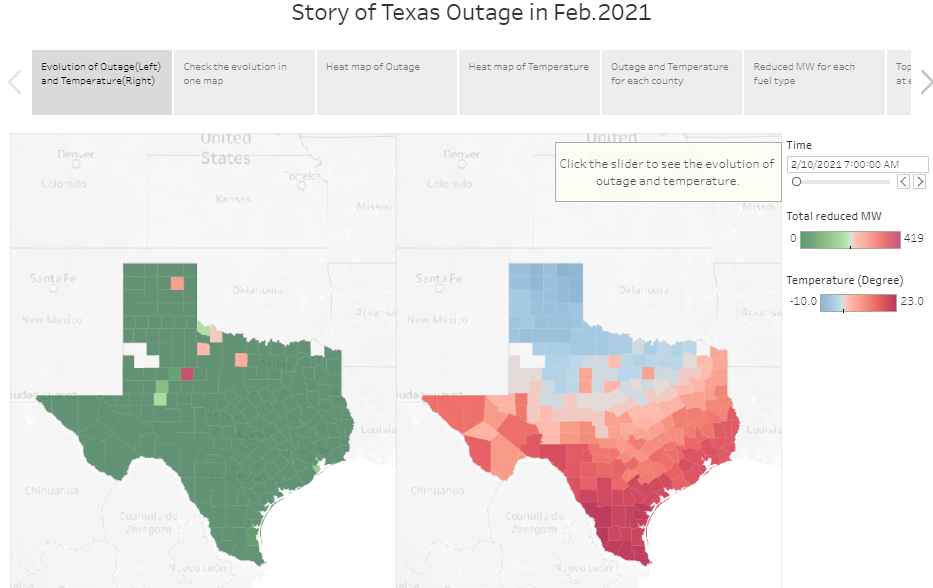
4.1 Evolution of outage(left) and temperature(right)
The slider can help user select time.
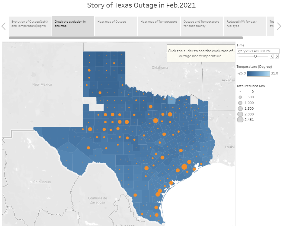
4.2 Comparing the evolution in one map
The color represents the temperature, the size of dot represents the total reduced power. The slider can help user select time.
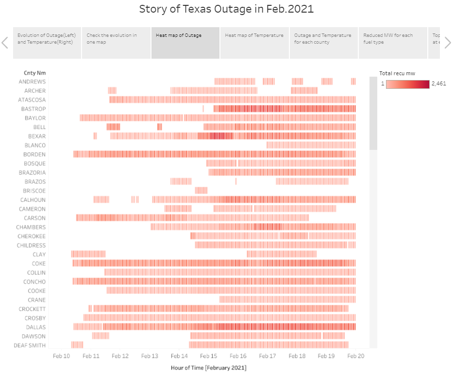
4.3 Heatmap of counties’ total reduced power at each time
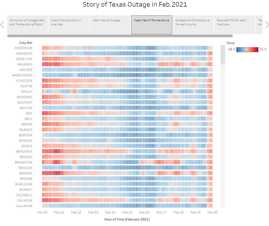
4.4 Heatmap of counties’ temperature at each time
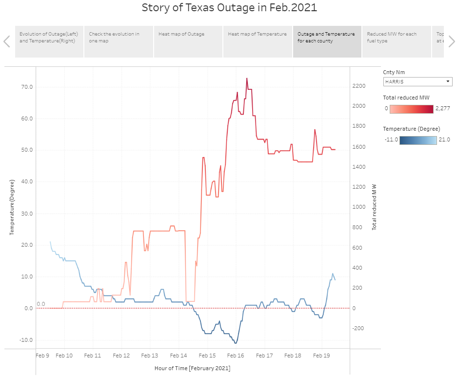
4.5 Line chart of each county’s temperature and reduced power
In drop-down menu, the user can select county.
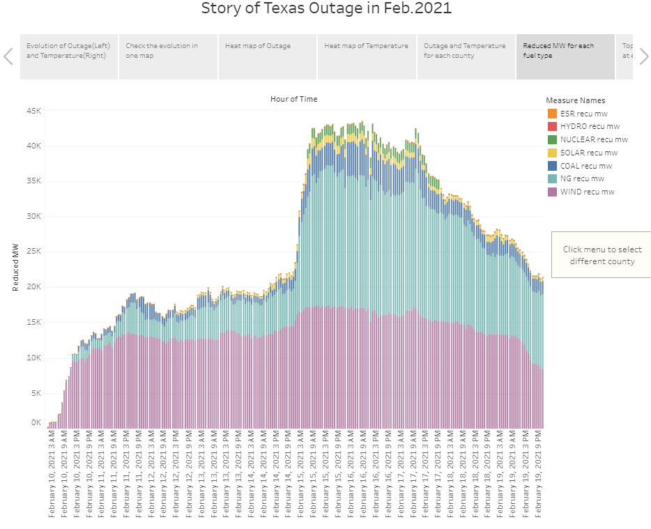
4.6 Total reduced power by fuel type
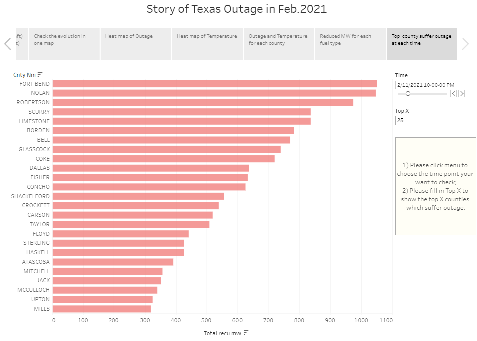
4.7 Top X counties suffer power outage at each time
The slider can help user select time. User can set X in the text box.

Comments